AnalyTex Portfolio
 Examples Of Our Final Data Dashboard Products
We specialize in building Tableau dashboards that transform complex datasets into clear, interactive insights. Below are examples of our final dashboard products, each tailored to specific business needs and decision-making contexts. Click any image to view the live version on Tableau Public.
Click any box to see detailed information about each of these finished data initiatives.
Learn More By Visiting Our Tableau Public Profile Page

Built to help sales leaders track product velocity and prevent end-of-quarter panic. This dashboard visualizes sales funnel health, churn trends, and account coverage, enabling proactive decision-making across regional teams.
Created for a hardware company’s leadership to unify field performance and commercial sales. The dashboard blends service logs and CRM data to track rep activity, territory issues, and sales progress at a glance.
Non-profit collaboration visualizing US oil fracking trends. Filters allow deep dives into chemical usage and well data by location and operator, giving researchers and analysts a powerful storytelling tool.
Public-facing dashboard showing solid waste facility data across Texas. Designed to make opaque datasets from state agencies useful to municipalities and industry players alike.
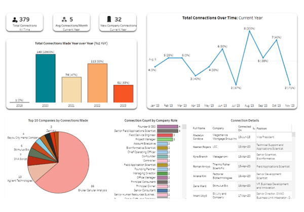
Built for personal use, later scaled for recruiters and BD pros. This dashboard surfaces themes in professional connections across titles, companies, and industries over time.
Designed to help event planners pick the most reliable airport hubs. Combines US DOT delay data and route patterns into a vibrant, interactive decision tool—ideal for presentations.
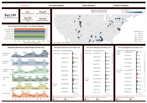
Commercial Pipeline Analysis
Our customer approached us with a need to utilize their existing enterprise data to create a tool for managers to ensure sales targets were being met. After understanding stakeholder requirements, we developed the Pipeline Analysis dashboard. This comprehensive 4-tab interface provides detailed insights into current account churn, sales team performance, and product velocity. Using control data for this example, this solution empowers managers to monitor critical metrics and make informed decisions to drive sales effectiveness and business growth.
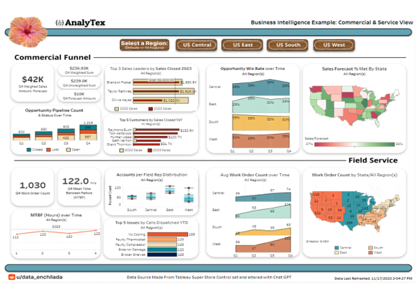
Commercial & Field Service
Our customer needed a unified view to monitor elements of their field service performance and commercial sales pipeline, which required integrating data from two different applications. We developed the Commercial & Field Service dashboard, creating a custom pipeline to merge these distinct data sources. This visualization allows users to see high-level information, such as year-over-year sales funnel performance and total incoming work orders. Additionally, it enables seamless filtering by US regions for more targeted analysis, providing a comprehensive tool for evaluating both field service and commercial metrics.
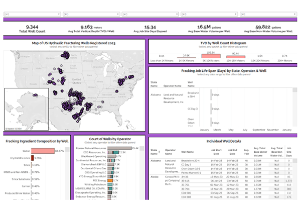
Understanding Markets
A customer approached us to help them better understand US oil fracking markets using data from a non-profit source. We cleaned and visualized their provided export, offering robust visibility into various aspects of this lucrative market. The finished product displays detailed information, including the location of each well on a US map and the chemical compositions of each operation as recorded. This enables users to identify possible trends and easily filter for relevant dimensions, providing a powerful tool for market analysis.
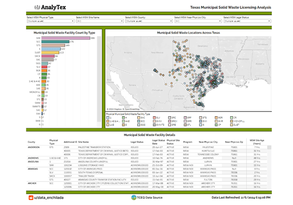
Navigating Government Data
Our customer needed to visualize data from the Texas Commission on Environmental Quality regarding municipal solid waste facilities in Texas. They asked us to show on a map where these facilities are located, their types, and information about their operational licensing from the state. We created this specific dashboard to transform the otherwise overwhelming tabular data into an intuitive visual format. This dashboard allows users to easily navigate the data and filter according to their analysis interests, providing a clear and detailed overview of municipal solid waste facilities across Texas.
Social Network Trends
Our customer wanted a better view of their LinkedIn data, which LinkedIn provides to everyone for free. This data included information about their new connection history, job titles, companies, and descriptions. We took their export and created the “Network Trends” dashboard, making it simple for them to understand trends over time, identify connections with key words of interest in their descriptions, and analyze several other aspects of network intelligence.
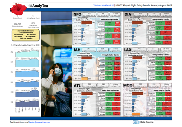
Making Logistics Legible
Our customer asked us to help determine which of six selected American cities they should host a customer conference in, based on average delay times and airline performance at each airport. Utilizing exports from the US Bureau of Transportation Statistics, we analyzed the data and created an engaging dashboard. They wanted it to be fun to share for use in a large group presentation, so we enhanced the design using Figma. By integrating real pictures and creating unique graphic representations, we made the data consumption experience more enjoyable and impactful for users.

